 |
|||||||||||||||||||||||||||||||||||||||||||||||||||||||||||
|
|
|||||||||||||||||||||||||||||||||||||||||||||||||||||||||||
       |
Regular Articles Vol. 13, No. 1, pp. 48–53, Jan. 2015. https://doi.org/10.53829/ntr201501ra1 Color-temperature Correspondence: Its Nature and Its Impact on Object Temperature PerceptionAbstractColor cues are often used to represent information concerning temperature, with red typically being associated with warm/hot, and blue with cold. Recent research from NTT Communication Science Laboratories demonstrated that such correspondences between color and temperature are not merely a design practice derived from a common sense belief. Instead, they have an actual impact on our information processing efficiency and object temperature perception. These findings are useful for the development of multimodal interfaces whose purpose is to provide a holistic experience in telecommunication and virtual environments. Keywords: multisensory information processing, multimodal interface, temperature perception
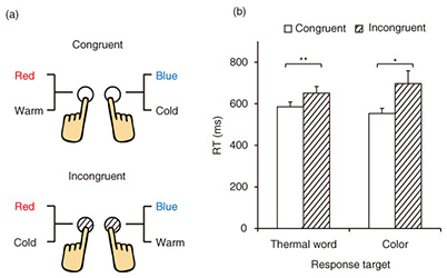
1. IntroductionIn developing multimodal interfaces aimed at providing a holistic experience in telecommunication and virtual reality environments, it is important to understand how our brains process and integrate multisensory information in order to achieve optimal performance. Color cues have been widely used to indicate information concerning temperature in the fields of industrial and interior design [1–4], and therefore, our current research on multisensory information processing focuses on such correspondences between color and temperature. Correspondences between color and temperature have been studied by asking people to rate colored stimuli as being either warm or cold [2, 3, 5–7] or by instructing people to report which color they were reminded of when a thermal stimulus was presented to them [6]. As expected, people reported the color red being more often associated with warm, and blue with cold. This kind of association has been shown to affect people’s feelings of warmth and coldness, with reddish colors inducing warm feelings and bluish colors inducing cold feelings [3, 7–12]. The effects of color shown in those studies are presumably knowledge-based. That is, the effect may result from direct employment of the knowledge of red-warm/blue-cold association per se, since in those previous studies, only subjective measures were used, and in most of the experiments the warmth and coldness were only thought of, rather than being physically presented. In our research on color-temperature correspondences, we investigated whether such correspondences could have an actual impact on people’s information processing efficiency and object temperature perception. The findings are expected to be useful in designing multimodal interfaces that aim to represent thermal information in virtual environments. 2. Impact of color-temperature correspondences on efficiency of information processingWe utilized two objective behavioral measures: the Implicit Association Test (IAT) and a priming task in order to examine what impact color-temperature correspondences have on information processing [13]. Both paradigms use reaction time (RT) as an objective task performance measure. 2.1 Simplified IATIAT is widely used in social psychology to assess the strength of an individual’s automatic associations between different concepts [14]. Here, we adapted a simplified version of IAT introduced by Parise and Spence [15] to examine the correspondences between color and temperature. In the experiment, a series of color patches and thermal words were presented on a display, one at a time. The participants’ task was to categorize thermal words (warm versus cold) or color patches (red versus blue) with two response keys. We manipulated the assignment of the color and temperature to each response key, as shown in Fig. 1(a). The foundation of the IAT is that it is easier to map two concepts into the same response key when they are internally associated (congruent) than when they are internally unrelated (incongruent). The participants consisted of 11 people (6 women), between the ages of 19 and 37; all had normal color vision. We found that people’s responses were faster with congruent key assignments (red-warm, blue-cold) than with the incongruent key assignments (red-cold, blue-warm), regardless of whether the response target was a thermal word or a color patch (see Fig. 1(b)). Our results indicated that correspondences between color and temperature affect the speed of response to a color or thermal stimulus. Incongruent combinations may lead to a prolonging processing time.
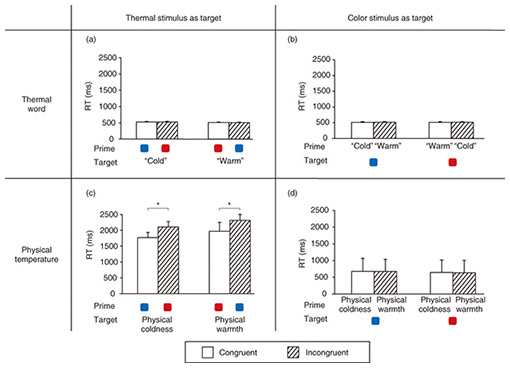
2.2 Priming taskWe also used a priming task to investigate the interaction between color and temperature during information processing. In the experiment, color and thermal stimuli were presented sequentially in each trial, with the first stimulus acting as the task-irrelevant prime and the second stimulus as the target. When the prime consisted of a color stimulus, the target was a thermal stimulus, and vice versa. We manipulated the congruency of prime and target presented in each trial, so that half of the trials were congruent (e.g., red and warm) while the others were incongruent (e.g., red and cold). The color stimuli used were color patches, and the thermal stimuli used were words such as warm or cold that indicate thermal conditions, or physical warmth or coldness applied to the skin of the participant’s index finger. The participants consisted of 31 people (23 women), between the ages of 19 and 61; all had normal color vision. They were instructed to discriminate the color target (i.e., red or blue) or the thermal target (i.e., warm or cold) as rapidly as possible. Our purpose was to assess the influence of a prime stimulus on the perception of the target stimulus under different color-temperature combinations. We found that exposure to a thermal stimulus had no effect on the RTs to discriminate the color of a stimulus (Figs. 2(b) and 2(d)), regardless of whether the thermal stimulus was semantic or physical, but exposure to a color stimulus did affect the RTs required to discriminate a physical temperature (Fig. 2(c)). This asymmetrical effect suggested that the color-temperature association might be stronger in the direction of color to temperature than temperature to color. This is not unexpected given that colors are often used to indicate temperature, but temperature is seldom used to indicate color. It was also found that when the target was a thermal word, there was no effect (Fig. 2(a)). However, when the target was a physical temperature, the RTs were significantly faster with a congruent prime (Fig. 2(c)).
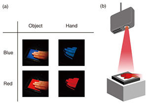
While IAT indicated that the correspondences between color and temperature have similar effects on the speed of response to a color or a thermal stimulus, a priming task showed that the correspondences are more effective in reducing the RTs for physical thermal stimuli than for color stimuli. This difference in the results presumably comes from the difference between these two paradigms. In IAT, a single stimulus is presented in each trial, and this design ensures that the effects result from the difference in the color-temperature congruency between the two stimulus-response key assignments (See Fig. 1(a)), rather than the stimulus per se. Therefore, similar effects were obtained for a color and a thermal stimulus as long as the color and temperature were associated. In contrast, in the priming task, two stimuli are presented in a single trial, and this design allows for the possible interaction between the color and thermal stimuli during information processing. Thus, the effect of color-temperature correspondences would be more effective for a target stimulus that requires a relatively long processing time such as a physical temperature (RT of ~2000 ms, see Fig. 2(c)). This is because a congruent color prime may facilitate people’s classifying/labeling a physical temperature to the response categories warm and cold and therefore reduce the RTs. In the case of a color target, the facilitation would be limited because its RTs are already short in the first place (500–600 ms; see Figs. 2(b) and 2(d)). In summary, our findings from both tasks demonstrated that the correspondences between color and temperature have an effect on information processing efficiency. These findings are useful for the design of multimodal interfaces that intend to convey information with both visual (color) and thermal feedback. 3. Impact of color-temperature correspondences on object temperature perceptionWhile our research introduced in section 2 confirmed that correspondences between color and temperature have an actual impact on information processing efficiency, it remains unclear whether such correspondences can influence temperature perception. Although previous studies have shown that color-temperature correspondences can affect people’s feelings of warmth and coldness, in most of these studies the temperature information was presented to the participants in an indirect, non-contact fashion [3, 7–12]. Because the most intuitive and natural way for people to obtain temperature information is to directly touch the object of interest, our purpose was to understand whether colors can still exert an influence under this circumstance. Although an old study reported some effects of color on object temperature judgments (e.g., green objects were more likely to be judged as warm than purple objects) [16], it remains unclear whether and how the effect is associated with the prevailing color-temperature correspondences. When a hand touches an object, the feelings of warmth or coldness depend on not only the object temperature but also the hand temperature [17]. Accordingly, we studied the effect of color on object temperature perception by manipulating either the object color or the hand color while participants touched an object (Fig. 3(a)). We developed a novel multimodal system that utilizes a thermal display and advanced projection technology (Fig. 3(b)). This system can project colors onto the hand region selectively when the hand touches the object surface, and it can also control the temperature of the object surface. We varied the temperature of the object surface and asked the participants to judge whether or not the object felt warm [18]. Our purpose was to see whether object and hand colors have an influence on the lowest temperature required for the object to feel warm.
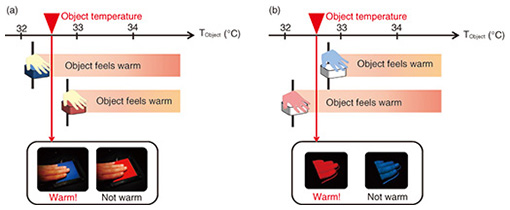
What we found is that colors can affect our perception of object temperature, but not in the way that people would expect. Our data indicated that a red object, relative to a blue object, raises the lowest temperature required for an object to feel warm by 0.5°C (see Fig. 4(a)). In other words, our results indicated that a blue object is more likely to be judged as warm than a red object of the same physical temperature, which goes against the general expectation from the red-warm/blue-cold association. When the hand was colored red or blue, a reverse effect was found. This time, the lowest warm temperature for a red hand was lower than that for a blue hand by about 0.5°C (see Fig. 4(b)), indicating that red hands made objects feel warmer. Although the effect of colors here might seem small at first glance, our hands are able to detect temperature changes as small as 0.2°C and to distinguish temperatures that differ by as little as 0.03–0.09°C [19, 20]; thus, a change of 0.5°C is in fact relatively large and clearly perceptible.
It is known that the brain integrates visual and tactile information when estimating the properties of an object explored by the hand [21]. For properties such as size or surface roughness, direct sensory inputs and expectations based on the visual information are averaged, so that the final perception is biased toward the expectations [21, 22]. In the case of estimating the temperature of an object, our data suggest that instead of taking the average of the expected and direct temperature inputs, our brain focuses on the difference between the two. As a result, the final perception is opposite to the expectation. Other object properties that have the same integration rule include weight, in which a larger object is tended to be judged as lighter than a smaller object of the same mass [23–27], and force, in which the perceived force from an impact on the palm is tended to be judged as weaker when the collision speed is fast compared to when the collision speed is slow [28]. In summary, our findings demonstrate that both object and hand colors can directly modulate temperature perception of an object touched by the hand and that the effect is opposite to the common red-warm/blue-cold expectation. 4. Applications to multimodal interface designWhile current applications of color-temperature correspondences mainly focus on modulating people’s thermal experiences in different environmental conditions and providing information concerning temperature with color cues, our new findings that color-temperature correspondences have an impact on not only the efficiency of information processing but also object temperature perception provide new guidelines for multimodal interface design. For applications involving visual and thermal feedback, as indicated in section 2, it is important to avoid presenting incongruent visual and temperature information, such as presenting the color red and a low temperature together, especially in situations where users need to respond to physical temperature information. This is because with incongruent combinations of color and temperature, the time required for users to process the information could be prolonged, and the performance of the interface would degrade. When the purpose of the interface is to create a holistic experience of interacting with an object in virtual environments or at a remote site, manipulating the object and hand colors with visual feedback can in fact modulate the perceived warmness or coldness during hand-object interactions, as indicated in section 3. For example, coloring a user’s hand red would make an object held in the hand feel warmer, and coloring a user’s hand blue would make the object feel cooler. It is important to note, however, that when manipulating the color of the object itself, the opposite effect is obtained. That is, when coloring an object red, it would give a cooler feeling instead of a warmer feeling. Because thermal feedback control is relatively complicated and requires special hardware, the effect of object and hand colors on temperature perception would allow a more energy-saving and lower cost multimodal interface. 5. ConclusionOur findings on color-temperature correspondences not only provide fresh insights on how our brains process multisensory information, but they are also expected to contribute to the development of interfaces for providing multimodal information and holistic experiences in telecommunication and virtual environments. References
|
||||||||||||||||||||||||||||||||||||||||||||||||||||||||||